Have you ever sat and wondered about the meaning behind the state seal of Idaho? No? Well, that’s not surprising since emblems such as the Great Seal are typically not considered much in daily life. Sure, it may be something that is taught in school, but over time we tend to forget the purpose and meaning behind such a thing. But that’s a shame because the Great Seal has a lot of meaning behind it, and a pretty interesting inception story to boot.
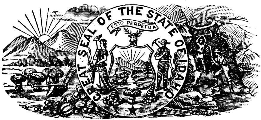
First of all, Idaho has the only seal in the U.S. that was designed by a woman. Emma Edwards Green created the seal back in 1891, during the women’s suffrage movement. Though it was still roughly 30 years before women had the right to vote nationally, the state-by-state suffrage movement was in full swing. Green noted that leading local men and politicians were leaning toward voting for women’s suffrage and felt that it wouldn’t be much longer until it was granted. With that in mind, she placed two characters in the seal: a male miner (the chief industry and leading occupation in the state at the time) alongside a female Lady Justice. This move to position them side-by-side signified not only equality but also freedom.
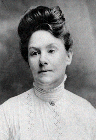
Emma Edwards Green.
In between the two characters is a shield, with a scenic mountain range and river (symbolic of the Snake River) inside its frame. In her submission statement to win the seal design contest, Green stated that she intentionally positioned the shield between the two as an emblem of “the protection they unite in giving the state.”
In addition to the (rather forward-thinking for the time) message of equality that Green brought to the seal, she also highlights the main industries of the state. Inside the shield, alongside the river and mountain range, stands an evergreen tree representative of timber interests. An elk head sits atop the shield to represent wildlife as well as Idaho’s game laws that protect the iconic animal. Below the shield rests a sheaf of grain symbolizing the state’s agricultural resources between two brimming cornucopias referring to horticulture. The state’s flower, the wild mock orange (or syringa), is also brought into the design at the woman’s feet next to tall growing wheat.
The colors used in the design were also intentional. With browns, greens, blues, and yellows, Green aimed to “use such colors as would typify pure Americanism and the history of the state.” She also noted that the state was a “virgin” or new state at the time, so to bring that out she clothed the female figure in all white, as well as placing a white liberty cap on the end of her spear.
The Latin phrase “esto perpetua” appears on the seal, which is the Idaho state motto and can be roughly translated to “it is perpetuated” or “it is forever.” This phrase was the Italian historian and statesman Paolo Sarpi’s last words as he died, speaking of his beloved home city of Venice, Italy, which inspired Green.
At the very bottom of the seal rests a simple star. This harkens to the “new light in the galaxy of states,” as Green put it. At the time, when she was creating this symbol for Idaho, it was in fact just that—the new West. Idaho was a new frontier that was about to enter the Industrial Revolution and a completely unimagined world—a world where, eventually, men and women would stand side by side together and come together in unity to protect what they loved. Of course, this utopian view has been far from realized, but there has been progress. And the industry, beauty, and strength that Idaho represented at its inception still ring true today. As most who live here would argue, it’s called the Gem State for a reason: a precious, shining land that we’re lucky to call home.